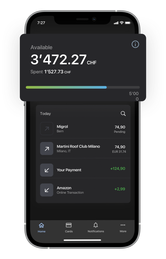
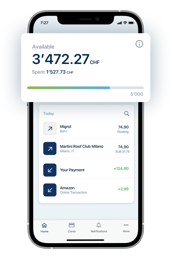
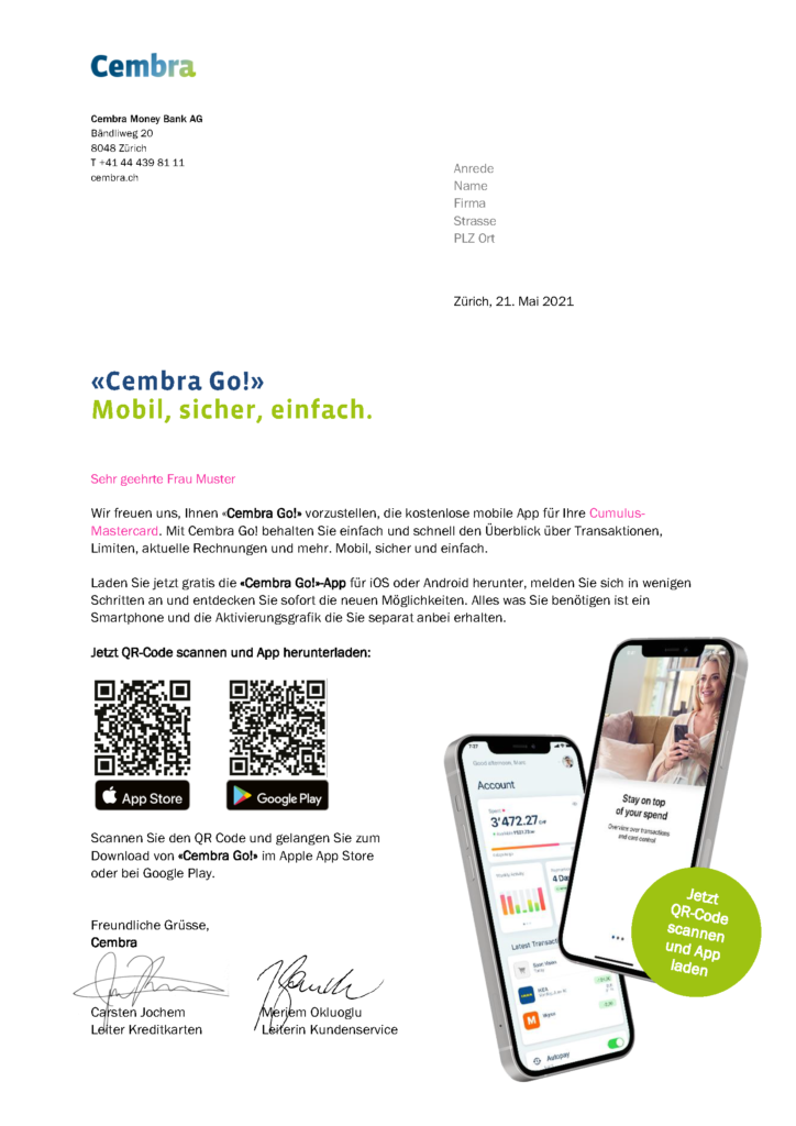
The Cembra project started in Switzerland in 2020. I was part of a team which was called to help renovate and launch a new mobile app for the bank.
The first thing we worked on together with the Bank was the full prioritisation scope, starting of course to define the MVP (Minimum Viable Product). This allowed us to start thinking what should come first, that would add more value to the end users, and what could be post-poned to the Backlog. The decisions were made based on existing research and data analysis, which was possible to extract from the existing app.
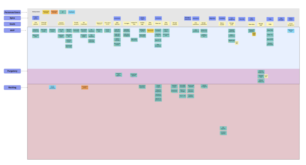
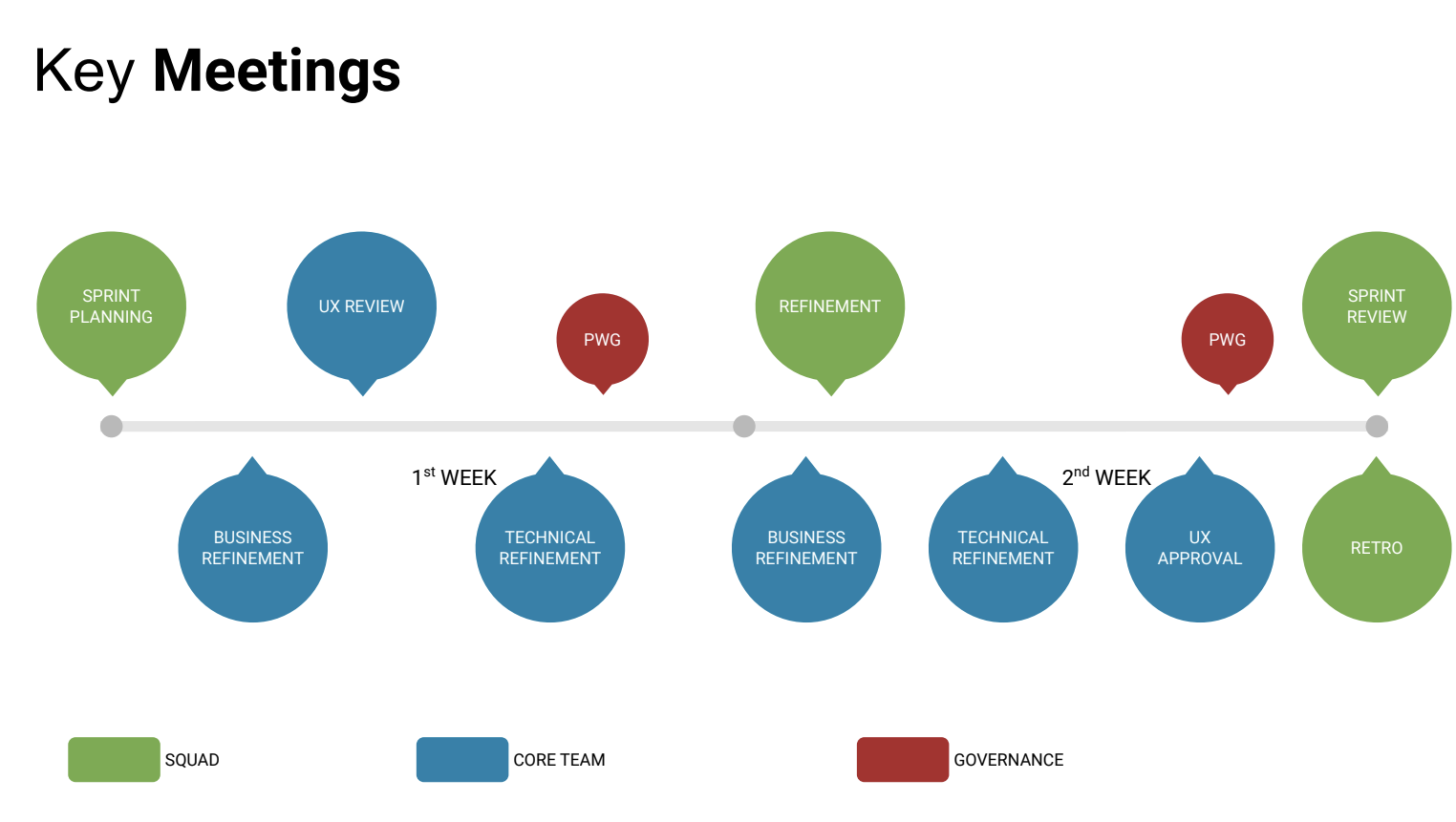
After analysing what goals were needed and create user stories for it, we grouped them under main Epics or Features. The next thing as we started to collaborate together in a new project was to create a list of Key Meetings to plan a Way of Working in the project which I took care of from a Design perspective.
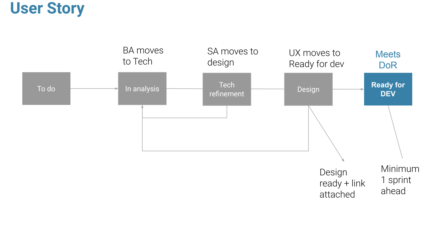
Together with The Business Analyst we also made sure the Statuses for each User Story were following the correct process.
Once we defined the Ways of Working the Scope, it was time to build the Design System. I’ve requested the Design Guidelines from the client and started to ingest it in the Style Library.
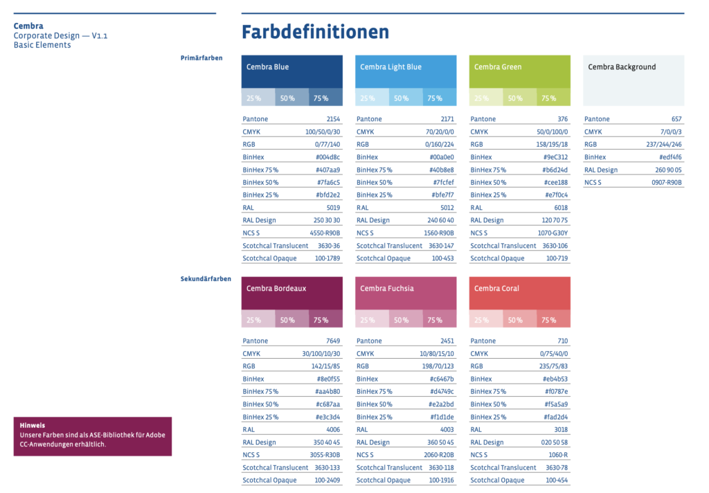
Above you can see a portion of what was taken from the client’s Brand Guideline, below instead is the Colors Style Guide which I’ve created for the project, together with the Logo Icons Typography etc.. which all together helped me build the Design System for the project.
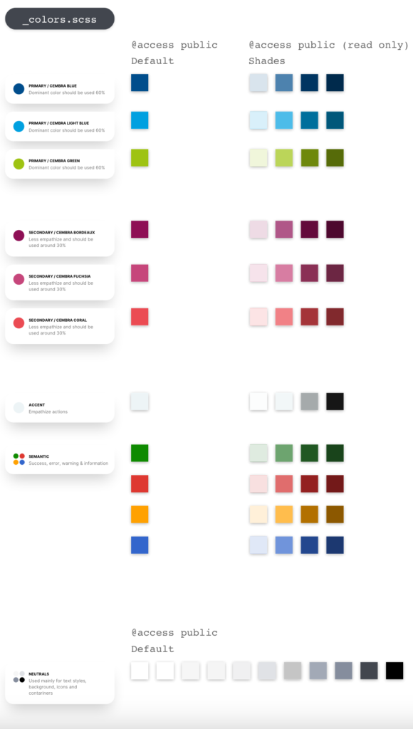
Here below a very initial stage of what the Design System looked like
